
Nia J.

Project Overview
My team was selected to partner with a small business to understand how collaboration could improve relations between Promenade and their customers, leading to an improvement in user satisfaction and product trust.
Scope of Work
This project sought to redesign the existing prototype of a Promenade, a website powered by machine learning, that provides personal recommendations to military veterans as they transition to civilian life.
Process
We started the research portion of this project by conducting a competitive analysis on our client, which progressed to user research then product testing. The competitive analysis allowed us to understand how Promenade brought value to its customers. This portion of research allowed us to build an understanding of how the Unique Value Proposition (UVP) could be used to attract the attention of the desired target audience through the redesign of the Minimum Viable Product (MVP). User research allowed us to determine the critical features and capabilities that should be present in the redesigned MVP. Product Testing occurred through three rounds of usability testing, which allowed us to understand the website’s intuitiveness as users sought to complete four tasks. Insights gained from all rounds of testing led to a scenario scorecard containing information such as scenario success rate and completion rate. Data from the scenario scorecards and qualitative data led to our MVP’s final recommendations based on all usability testing rounds.
Problem Statement
Through insights from our client’s competitive analysis, we identified the initial problem statement as:
How might we provide a way for veterans unexpectedly discharged to access post-military resources and guide veterans during their transition into civilian life?
Research
Goal of Research: Competitive Analysis
We wanted to understand how Promenade brought value to its customers.
Methodology: Business Model Canvas
Our team conducted market research for two days to have an accurate perspective of our client.
-
Promenade has a value-driven, self-service cost structure.
-
Desired users are post-9/11 military veterans unexpectedly discharged.
-
Machine learning is integral to its UVP.

Methodology: Feature Analysis
Our team analyzed competitors and comparators through ten features that we identified as common to websites that seek to be a resource for military veterans. The competitors we identified are in the same market as our partner, while the comparators offer similar functions/features in different markets or industries.
Competitors
-
Websites are free for users.
-
Key features: secure login process, informational landing page, ability to create a profile feature, or capabilities to store personal documents.

Comparators
-
Some websites are free for users with the option to upgrade to premium services.
-
Key features: account profile, progress visualization, microanimations, gamification.

Overall Takeaways: Competitive Analysis
Conducting competitive analysis allowed our team to determine how Promenade can showcase its competitive advantage through the use of machine learning and the possible implementation of features such as free access to users, gamification, secure login portal, and microanimations. These findings allowed our team to craft appropriate questions necessary for our screener survey in order to progress to user research.
Goal of Research: User Research
We set our to understand how participants feel about the plethora of websites and the informational architecture of such websites available to veterans.
Methodology: Screener Survey
For two days, our team created and distributed a screener survey to military veterans. We formed the questions from insights gained through competitive analysis. We sought to contact people considered apart of our target audience- post-9/11 veterans of color. At this stage of research, we recognized the need to represent the specified subgroup, women veterans of color, through all portions of user research and product testing.
Findings
-
All branches of the military were represented.
-
Over 70% of participants confirmed their enlistment date was post-9/11.
-
Majority of participants were between the ages of 26–36 years old.
-
90% of participants were interested in being contacted for a user interview.
Methodology: User Interviews
For two days, our team moderated user interviews over Zoom.
-
Seven people: five men, two women, all people of color.
-
Interview script used for all interviews.
-
We recorded all interviews with user permission to collect insights.
Findings
-
Community & Support systems were essential for veterans to have a successful transition.
Overall Takeaways: User Research
Military veterans of color, unexpectedly discharged from the military, were very open to share their discharge process and provide suggestions on how it could be improved.
Synthesis
The responses from user interviews led to the synthesis of data which started with the creation of an affinity map, a tool used to identify trends/patterns in user feedback.
Methodology: Affinity Map
Through Miro, responses from interviewees/users were placed on color-coded post-it notes then organized based on themes.
Takeaways
-
It’s easier for veterans to lean on others that they served with to assist in their transition.
-
Seasoned veterans’ help and advice based on their personal experiences were the most helpful.
-
Having an accurate timeline to follow during the transition helps veterans reach their goals promptly.
-
Existing networks secured veteran’s chances of getting a job after the military.
Trends included networking, mentorship, and the struggles with assimilating to civilian work life.

The trends and insights from affinity mapping led to the formation of a persona, meet Marie.
Methodology: Persona
In order to get a clear understanding, of our ideal user's goals, needs, and pain points we compiled all our data and personified it through the formation of Marie.

Marie is a 29-year-old Navy veteran currently residing in Norfolk, Virginia. When she transitioned last December, she accepted a job as an administrative assistant, but has grown frustrated as she feels it does not utilize her previous experience as a sub engineer. Also, Marie is feeling overwhelmed with questions and establishing up a life outside of the military with no insight on whom to lean on for advice.
Goals:
-
Become financially independent from my support system.
-
Find a mentor who can provide support and advice during my transition.
-
Find a civilian job that utilizes transferable skills from my military experience.
Needs:
-
Find resources that are specifically tailored to my situation.
-
To feel understood and at ease when interacting with civilians.
-
Receive one-on-one advice from someone who has successfully transitioned.
Pain Points:
-
An inability to find concise and up to date resources.
-
Feeling my work ethic and communication style does not match civilians.
-
Not having veterans to guide me during my transition.
Takeaway
Our ideal user's aspirations, necessities, concerns, and emotional state are focused on finding a support system that can successfully provide guidance on how to showcase value for civilian roles and establish financial independence.
User Journey
Methodology
In order to create more empathy for our ideal user, we created a journey map that allowed our team to understand Marie’s emotions and behavior while balancing a job and trying to establish a meaningful civilian career. This user journey allowed us to effectively identify how we can provide a solution to the problem(s) she is trying to manage.
The task: Balance a job & Establish a Meaningful Civilian Career.

Takeaway
The inability to find civilian jobs that could benefit from Marie's transferrable skills and the lack of a mentor are experiences that are not conducive to her goal of achieving financial independence.
Overall Takeaway: Synthesis
The formation of a persona and the creation of a user journey allowed our team to reexamine our problem statement and revise it based on the insight from data synthesis.
Revised Problem Statement
From our research, we learned that most users enlisted post-9/11; their military network is not established enough to gain employment and easy access to veteran resources. They require the services of our client, Promenade, to find a mentor to provide advice during their transition, secure civilian employment, and become financially independent through personalized recommendations powered by machine learning.
How might we offer access to personalized resources for veterans while creating a sense of community among service members as they transition to civilian life?
After our team revised the problem statement, we wanted to assess the current intuitiveness of Promenade's website by focusing on its informational architecture.
Informational Architecture
Promenade's Existing Prototype
Our team analyzed Promenade's existing information architecture through an unmoderated tree test and card sort for three days, which were created through Optimal Workshop.
Tasks
Through insights from data synthesis our team created four tasks that we believed would accurately access the intuitiveness of Promenade's existing site.
-
While transitioning from the military into civilian life, you start experiencing possible symptoms of PTSD. Find mental health resources for your current situation.
-
You’re interested in reading about other veterans’ post-military experiences. Find popular topics being discussed now.
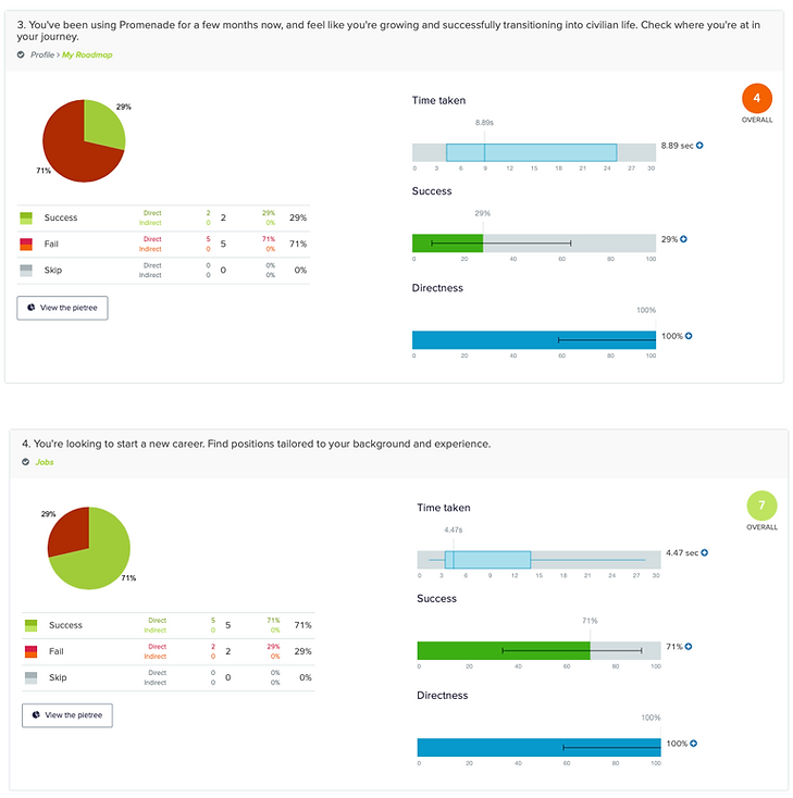
-
You’ve been using Promenade for a few months now, and feel like you’re growing and successfully transitioning into civilian life. Check where you’re at in your journey.
-
You’re looking to start a new career. Find positions tailored to your background and experience.
Methodology: Tree Test & Closed Card Sort
To determine if information is grouped logically based on user behavior we created a tree test. Users were prompted to navigate through the current primary and secondary navigation to accomplish the four tasks.
To determine how users think information is organized within the current framework, we created a closed card sort. Users were prompted to sort cards with the names of webpages apart of secondary navigation into categories which were the names of webpages apart of the primary navigation.
Tree Test Takeaways
-
7 users completed the tree test at an average time of 2 minutes 7 seconds.
-
Task 1 had the most indirect success, while Task 3 had an even percent of direct and indirect success (29%, 57% overall success).
-
Tasks 2 and 4 had the least amount of users to complete the objective through direct success.
-
Task 4 had the highest failure rate of 100%, with 86% derived from direct failure.
Insight:The site is not intuitive for any tasks to experience direct success of 100%.


Card Sort Takeaways
-
8 users completed the card sort in an average time of 2 minutes 41 seconds.
-
In the Results Matrix, Employment, Your Feed, Your Unit, Trending Conversations, and Recent Jobs Applied had the most user consensus in terms of categorization.
-
Through the popular placement matrix, Jobs, Profile, and Blog were the most popular groups that had individual cards with placement scores of over 60%.
Insight: Most users understand how the information is categorization within Promenade's current framework.

Overall Takeaways: Existing Prototype
Users understand the organization of information but the navigation of the site could greatly benefit from a research-based redesign.
After we progressed to the design portion of our project (which will be discussed later), we created a mid-fid prototype and assessed the informational architecture of Promenade's site navigation redesign.
Our Redesign

Methodology: Our Mid-fi Prototype
Through insight gained from product testing (which will be discussed later), we created a mid-fi prototype and analyzed how users navigate through the redesign and if they believe information is organized correctly.
Tasks
Same tasks used for the existing prototype.
Tree Test Takeaways
-
7 users completed the tree test at an average time of 2 minutes and 30 seconds.
-
Tasks 1 and 4 had the most direct success, while Task 3 experienced the most direct failure.
Insight: Task 1 and 4 had the most satisfactory intuitiveness while Task 3 has the most improvement needed for site navigation.

Card Sort Takeaways
-
8 users completed the card sort in an average time of 4 minutes 33 seconds.
-
In the Results Matrix, Education resources, Mental Health resources, Legal Resources, and VA Compensation had the most user consensus in terms of categorization.
-
Through the popular placement matrix, Home, Resources, Community and Profile were the most popular groups that had individual cards with placement scores of at least 50%.
Insight: The site navigation for Resouces needs the least amount of redesign, while the Home and Profile site navigation could benefit from more redesign.

Overall Takeaways: Mid-Fi Prototype
Results of the tree test showed that Tasks 1 and 4 greatly improved from redesign but Task 3 did not. While the closed card sort experienced more prominent user consensus when compared to the existing prototype.
Overall Takeaways: Informational Architecture
Site navigation improved for 50% of the tasks, therefore there is still room for improvement, and room for growth was also evident through the user categorization of new and renamed webpages.
Design Phase 1
Actionable Insights
The insight gained from user research led to actionable insights that influenced the identification of four key features. These insights and initially proposed features led to the creation of the previously mentioned persona and user journey.
Veterans found it easier to lean on other veterans they served with during their transition because they shared the same experiences.»Community page/My Unit.
Veterans’ mentorship and advice based on their own experiences in navigating the transition to civilian life.» Mentorship page/ Recommender page.
Having an accurate timeline to follow during the transition process helps veterans reach their goals in a timely manner.» Road map or schedule.
My existing network secured my chances of getting a job after leaving the military.» Community Page
Methodology: Design Studio
Our team and client stakeholders created low fidelity wireframes to ideate potential design solutions for the problem space while keeping the competitive analysis and user research in mind. This fidelity consisted of paper wireframes created through two rounds of a design studio where each team member sketched for five minutes, followed by an explanation and critique by the team.
Takeaways
-
Have gamification as an integral feature of the website.
-
Implement a sense of delay in processing information inputted by users to ease the apprehension of machine learning capabilities.
-
Call to action/prompts should be conversational.
Insight: Redesign Promenade's site to give users a sense of accomplishment as they complete prompts derived from artificial intelligence recommendations.

Methodology: Mid-fi Wireframes
The results of round 1 of product testing led to the creation of mid-fidelity wireframes, which progress to a mid-fi prototype. This fidelity differentiated from the lo-fi wireframes and existing prototype by being a purely digital iteration influenced by user interviews and round 1 of product testing.
Takeaways
-
This fidelity was our team’s first digital design to showcase the influence of user research and round 1 of product testing.
-
Specifically, we discovered that “Recommendations” was not an appropriate name for a webpage based on product testing. Instead we redesigned the webpage with the name “Resources”.

Methodology: Hi-fi Wireframes
We reiterated wireframes for high fidelity based on the results of round 2 of product testing. This fidelity contained the four essential features identified through user research, a brand style, and improvements to site navigation based on a prior round of product testing.
Takeaways
-
Based on the results of product testing, we determine that there was a need to personify the artifical intelligence and enhance gamification in various section of Promenade's site.

Product Testing
Insights gained from research and the results of design sessions allowed our team to progress to product testing.
Methodology: Initial User Testing
After data synthesis from user research and the results of assessing Promenade's existing informational architecture, our team created 4 tasks to test based on insight gained through user interviews.
Task 1: Register for an account.
Task 2: Find a fellow veteran who can guide you through this transition.
Task 3: Find your progress tracker to see the next steps you need to take in order to achieve your goals.
Task 4: Find a way to connect with others you served with.
Takeaways
-
Task 2 experienced the most indirect success, while task 3 & 4 experienced the most failure.
-
The average time to complete each task was about one minute.
Insight:Users are not satisfied with the current information architecture of Promenade’s prototype. The site is not intuitive to satisfy the direct success of all fours task given in user testing.

We experienced a pivotal moment in our project when several users repeated that they would like to know the source of their recommendations, this insight led to the renaming of a webpage.
Methodology: Second Round
After constructing a feature prioritization matrix, conducting a design studio, and the first round of testing, our team built a mid-fi prototype to assess the intuitiveness of Promenade's redesign. The tasks were the same as those used in the first round of testing.
Takeaways
-
Users would like a more detailed registration process, especially for areas related to military position history (MOS). Older users struggled with the overall registration process.
-
3 out of 5 users wanted to explore the secondary navigation of jobs, which was not developed for this usability testing phase.
-
The majority of users also expressed an interest in having community filters such as searching for unit members by branch, last name, or location.
-
Users who are/were not enlisted in the Army did not like the use of army ranking for the user profile roadmap feature.
-
Users identified the site as having the ability to be a “one-stop shop” in terms of the range of accessible services through the website.
-
There's a need to personify artificial intelligence to ease the distrustfulness of machine learning for users.
Insight: The redesign allowed the site to be more intuitive for users through new features such as a redesigned progress tracker with illustrations. Additionally, the site redesign provided focus on the next phase of the redesign (registration process and enhanced features for Community webpage) which led to the final round of testing.

Methodology: Final Round
After reiterations based on rounds 1 and 2 of testing our team assessed 4 tasks for a final round of product testing. The tasks were the same as those used in the first and second round of testing.
Takeaways
-
This round did not experience any task failures.
-
Users liked the pop-up buttons on the landing page and the display of mentorship as an important category.
-
On the community page, users wanted “My Unit” changed to “My Network” to signify the transition to civilian life.
-
Users thought the "Community" and "Mentorship" webpages looked similar and it was difficult to differentiate between them.
-
Users would also like an option to select if the call to action does not apply to them, e.g., any of the above.
Insight: Further reiteration for redesign proved to be beneficial in increasing the intuitiveness (based on success rate) of Promenade's site. The implementation of new features such as a description of the mentors' expertise with a photo, increased the task completion time but did not hinder the success of the task.

Changes after Product Testing
After the final round of product testing, additional changes were made to Promenade's redesigned site to further improve intuitiveness.
-
A small text box will disclose that the at-risk focus will only be used to improve the personalized experience, to ease user apprehension during registration.
-
We edited the Mentorship webpage’s visual design to have greater differentiation when compared to the Community webpage.
Our Team Suggestions
For the next cycle of the agile process, our team suggested that Promenade:
-
Have an “Add photo/video” feature to posts on the Community webpage. Visually redesign the contact button, so it’s more intuitive for users to contact mentors.
Final Recommendations
For our final recommendation, we believe that it will be necessary to bring in a professional illustrator to create a unique battle buddy character. Our battle buddy simply served as a placeholder until one can be fully illustrated. We believe the more personable we are able to make the “battle buddy” the more comfortable users will be with sharing private information.
We would like to suggest implementing a “mental health check-in” after logging in to Promenade each time based on what we heard from users.
Lastly, three is a need to continue improving the gamification of the website.
Next Steps: Google HEART Framework
To determine if the website redesign successful, we suggested Promenade measure success through metrics analyzed within the Google Heart Framework.

Continued Product Testing
For the next cycle of the agile process, we believe it will be necessary to product test the “Jobs” webpage and the implementation of a “mental health check-in.”
Overall Findings + Takeaways
Through competitive analysis, user research, reiterative design and product testing, our team successfully redesigned a website that improved the intuitiveness of user needs and satisfied business objectives.